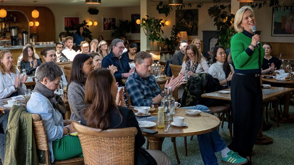
Behind The Brand
A new look for Broadsword
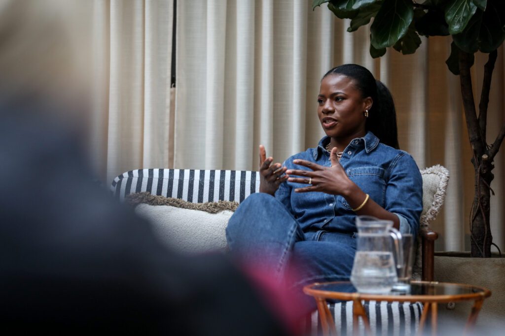
We have a conversation with our Creative Lead, Aisha Kareem, to dive into the new visual identity created in house for Broadsword. Aisha talks through the brand identity and the personality and energy it brings across every element.
What sparked the decision to rebrand Broadsword?
When I joined Broadsword as Creative Lead, rebranding wasn’t part of the plan. But as I settled in, got to know the people, the culture, the way we work, it became clear we were a lot more than who were saying we were.
Our work was brilliant, our team was talented and thoughtful, and clients saw us as trusted, long-term partners (some for nearly two decades!). However, our brand didn’t reflect how far we’d come, from a production company to a full-service creative agency.
We needed an identity that matched who we are now with who we want to be.
Where did you start?
With conversations. Lots and lots of them.
Across departments and roles, we asked questions like ‘What do you think makes Broadsword different?’ and ‘How would you like people to feel when they engage with us?’. These conversations laid the foundation for everything that followed.
What themes came out of those conversations?
A strong sense of us being collaborative, bold, thoughtful, and very human. And the amazing thing was that it wasn’t just internally. We saw the same reflections in client feedback and post-event debriefs. We wanted our brand to express that balance: confident but approachable, knowledgeable but curious.
How did those ideas shape your rebrand goals?
We landed on four clear goals:
- Establish a stronger, more distinct presence in the events industry
- Support new business growth
- Align who we are with how we’re perceived
- Create internal clarity around our brand and how we communicate it
How did those goals influence the visual identity?
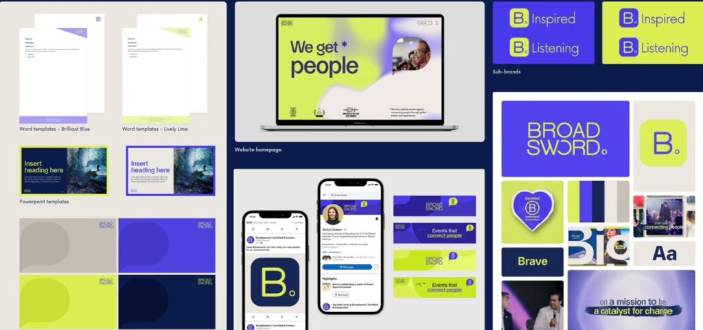
A lot! One of the core ideas was conversations; the thing that underpins our long-standing, trusted relationships with clients. When we broke that down, we landed on a powerful contrast: speaking and listening. Two opposites, working together. That idea of contrast became a connecting thread in our visual identity.
We explored how opposites could show up across our colours and typography. We chose colours that sat opposite each other on the colour wheel (complementary colours), almost like they’re in dialogue with one another. This introduced energy, contrast and a distinctive visual language that feels uniquely Broadsword.
We carried the same thinking through to our typography: pairing fonts that strike the balance between bold and friendly. And we refined our logo to be cleaner, more versatile, and more reflective of who we are now.
What about tone of voice?
Our tone of voice is reliable, but brave. Warm, but confident. We made our language more direct, confident and human while retaining our expertise. Our messaging and visuals now speak the same language, from our website to social content to pitch decks.
Was it tough doing this all in-house?
Yes, and totally worth it. It was intense at times (lots of late-night Figma pages and boards!), but the outcome is deeply authentic. Every single decision was intentional and came from within. We weren’t putting things together based on ‘vibes’, we were building from real conversations.
What does the new brand mean for Broadsword going forward?
It means we’re taking up space within and beyond the events industry with clarity and confidence. We’ve always had the talent, knowledge, experience and vision, and now we have a brand that feels harmonious and reflects that. It’s bold, it’s expressive, and it finally feels like us.